Drew Baker
Cart 0


Notion


The Challenge

Notion is centered around intelligence embedded into email. It filters, highlights, and prompts you to focus on what you have deemed important over time. The challenge was to take an existing brand experience that communicates approachability and simplicity in a world of high-tech complexity and transform an application-centered website into a broader experience about what Notion is focusing on in the present, and a site experience about the company, not just the product. The result was a human-centered site experience built for an artificially intelligent email platform; merging beautiful design with technology.

SERVICES PROVIDED

Discovery & Strategy

Interface Design


notion_hero.jpg
 

Our Approach

Notion asked Envisionit for a human-centered site experience while maintaining the integrity of what they had built in the technology space. Their end goal was to better connect with their users, and to show the human personality behind the technological machine they had built. We went through persona development, several rounds of prototyped layouts, and a messaging platform they could build upon. My personal contribution to this project ended before the final release of the live site, but the end deliverable hit right on the mark, resulting in a web experience Notion's users would be drawn to and helped them to build a platform for the new products they planned to roll out post launch.


Notion is the first-ever intelligence layer for email.


User Personas

Through a series of workshops with Notion onsite, we were able to identify select user personas that both used the software already in its alpha-phase, and those who will benefit from it given the proper introduction and positioning. These personas would later guide the user experience development of the site.

persona_hero-01.jpg
persona_close-up-02.jpg
persona_close-up-03.jpg
 

Experience Design

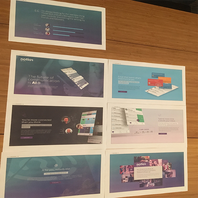
Our next step was to wireframe the pages. With the personas in mind, we build a web experience around Notion's desire to maintain a single page site. Layouts were created to showcase the flow of content and helped round out the sitemap exploration.


VISUAL DESIGN

It was at this point that I transitioned off the project, but the team continued to develop more concepts for the visual design and structure of the site. The beautiful end result can also be viewed live.


SCOPE OF WORk

Discovery & Strategy

Baseline Evaluation

Research

Experience Strategy

INTERFACE DESIGN

Wireframing and Prototyping

Visual Design

Responsive Design


Other Recent Projects

LOGGING SEIZURES | Masters Thesis Application Design

LOGGING SEIZURES | Masters Thesis Application Design

PTAM | Brand Refresh

PTAM | Brand Refresh